🗣 07. H.I.G에서 읽어본 Images
본 내용은 H.I.G - Foundations - Images를 편역한 것입니다.
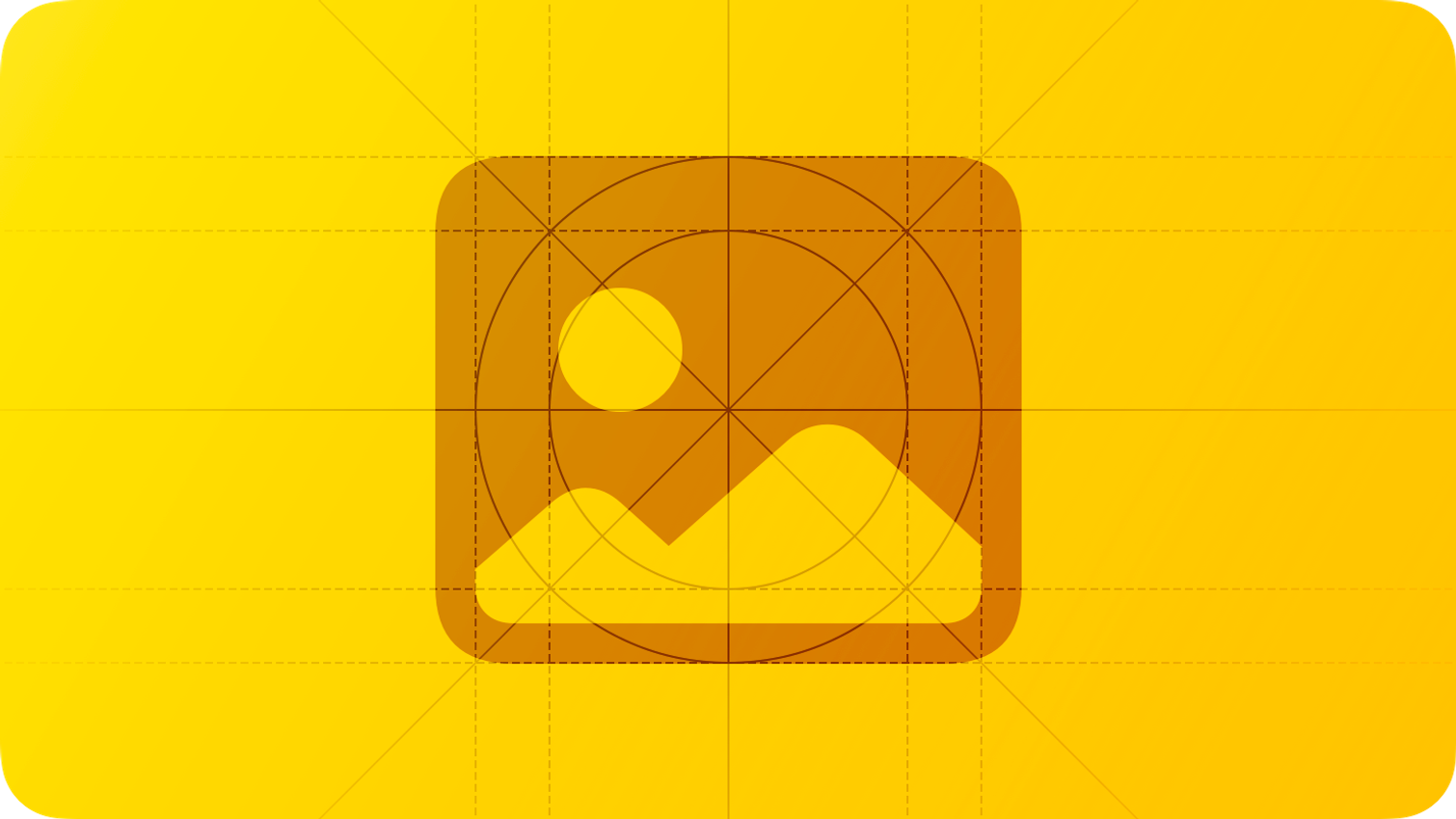
1) 이미지
모든 장치에서 결과물이 좋게 보일 수 있도록 돕기 위해, 어떻게 콘텐츠를 표시하고 적절한 규격으로 이미지를 전달하는지 배워야 한다.
To make sure your artwork looks great on all devices you support, learn how the system displays content and how to deliver art at the appropriate scale factors.
2) 해상도
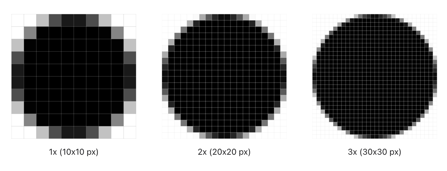
다른 장치들은 다른 해상도로 이미지를 표현할 수 있다. 2D 장치는 화면의 해상도에 따라 이미지를 표현한다.
점은 시각적 콘텐츠가 표시되는 방식에 관계없이 일관성을 유지할 수 있도록 도와주는 단위이다. 2D 플랫폼에서 점은 디스플레이의 해상도에 따라 달라질 수 있는 픽셀 수에 매핑되며 비전 OS에서 점은 시청자와의 거리에 따라 시각 콘텐츠를 확장할 수 있는 각도 값이다.
이미지의 해상도를 확인하기 위해, 척도 인자를 지정할 수 있다. 다양한 해상도의 2D 디스플레이에서 픽셀 밀도를 고려하여 스케일 팩터를 시각화할 수 있다. 예를 들어, 스케일 팩터의 1은 픽셀의 밀도를 1 대 1로 비교한다. 고해상도의 2D 디스플레이는 높은 픽셀 밀도를 갖는데 2:1 혹은 3:1의 밀도를 갖는다. 2:1 밀도는 2의 스케일 팩터를 갖는 것이며 3:1 밀도는 3의 스케일 팩터를 갖는다. 픽셀 밀도가 높은 경우에 고해상도 디스플레이는 더 많은 픽셀을 갖는 영상을 요구한다.
Different devices can display images at different resolutions. For example, a 2D device displays images according to the resolution of its screen.
A point is an abstract unit of measurement that helps visual content remain consistent regardless of how it’s displayed. In 2D platforms, a point maps to a number of pixels that can vary according to the resolution of the display; in visionOS, a point is an angular value that allows visual content to scale according to its distance from the viewer.
To identify the resolution of an image you create, you specify a scale factor. You can visualize scale factor by considering the density of pixels per point in 2D displays of various resolutions. For example, a scale factor of 1 (also called @1x) describes a 1:1 pixel density, where one pixel is equal to one point. High-resolution 2D displays have higher pixel densities, such as 2:1 or 3:1. A 2:1 density (called @2x) has a scale factor of 2, and a 3:1 density (called @3x) has a scale factor of 3. Because of higher pixel densities, high-resolution displays demand images with more pixels.
3) 형식
다른 형식으로 만든다면, 아래의 추천 지침을 따라라.
| 이미지 타입 | 형식 |
| 비트맵 혹은 래스터 작업 | 섞어 짜여지지 않은 PNG 파일 |
| 전체 24비트의 색상이 필요없는 PNG 그래픽 | 8비트 색상 |
| 사진 | 필요에 따라 최적화 된 JPEG 파일 또는 HEIC 파일 |
| 고해상도 스케일링이 필요한 평면 아이콘, 인터페이스 아이콘 및 기타 평면 아트워크 | PDF 혹은 SVG 파일 |
4) 좋은 예시
앱의 모든 예술 작품, 지원하는 모든 장치에 대해 고해상도 이미지를 제공하라. 각 이미지를 프로젝트에 추가할 때 파일 이름에 "@1x", "@2x" 또는 "@3x"를 추가하여 해당 축척 요소를 구별하라. 아래의 가이드라인을 참고하라.
| 플랫폼 | 비율 요소 |
| iPadOS, watchOS | @2x |
| iOS | @2x and @3x |
| visionOS | @2x or higher (for details, see visionOS) |
| macOS, tvOS | @1x and @2x |
Supply high-resolution images for all artwork in your app, for every device you support. As you add each image to your project’s asset catalog, identify its scale factor by appending “@1x,” “@2x,” or “@3x” to its filename. Use the following values for guidance; for additional scale factors, see Layout.
일반적으로 가장 낮은 해상도로 이미지를 디자인하고 스케일 업하여 고해상도 이미지를 만든다. 크기를 조절할 수 있는 벡터화된 도형을 사용할 떄 전체 값을 기준으로 1 배율로 깔끔하게 정렬할 수 있다. 2배와 3배는 결국 1의 배수이기 때문에 해당 위치 설정을 통해 포인터가 더 높은 해상도에서 정렬된 상태를 유지할 수 있다. 대조적으로 그리드에 완벽한 정렬 상태를 구현하고 싶지 않을 때도 있는데, 예를 들어 원을 그리드에 정렬하면 상단과 하단에서 원이 평평하게 보일 수도 있다.
각 이미지에 색상 프로필을 추가하라. 색상 프로필은 앱의 색상이 의도한 대로 다른 디스플레이에 표시되도록 도와준다.
다양한 실제 장치에서 테스트하라. 디자인을 했을 때 좋아 보이는 이미지라 할지라도 다양한 장치에서 볼 때 픽셀이 늘어나거나 압축되어 보일 수 있다.
In general, design images at the lowest resolution and scale them up to create high-resolution assets. When you use resizable vectorized shapes, you might want to position control points at whole values so that they’re cleanly aligned at 1x. This positioning allows the points to remain cleanly aligned to the raster grid at higher resolutions, because 2x and 3x are multiples of 1x. In contrast, there are times when you don’t want to keep a shape perfectly aligned to the raster grid; for example, aligning a circle to the grid can make it appear flattened at the top and bottom.
Include a color profile with each image. Color profiles help ensure that your app’s colors appear as intended on different displays. For guidance, see Color management.
Always test images on a range of actual devices. An image that looks great at design time may appear pixelated, stretched, or compressed when viewed on various devices.
5) 플랫폼 고려사항
iOS, iPadOS, or macOS 는 추가적인 고려 사항이 없다.
tvOS
겹겹이 쌓인 이미지는 애플 TV 사용자 경험의 핵심이다. 겹겹이 쌓인 이미지, 투명도, 스케일링, 그리고 움직임을 결합하여 사람들이 화면에 있는 콘텐츠와 상호작용하며 개인적인 연결을 불러일으키는 사실감과 활력을 만들어낸다.
Layered images are at the heart of the Apple TV user experience. The system combines layered images, transparency, scaling, and motion to produce a sense of realism and vigor that evokes a personal connection as people interact with onscreen content.
Parallax effect (시차 효과)
시차는 요소가 초점을 맞출 때 깊이와 역동성을 전달하기 위해 시스템이 사용하는 미묘한 시각 효과이다. 한 요소가 초점을 맞출 때 시스템은 요소를 앞으로 가져와 표면을 빛나게 하는 조명을 가하며 부드럽게 흔든다. 일정 시간 동안 활동하지 않으면 초점이 맞지 않는 내용이 줄어들고 초점이 맞춰진 요소가 확대된다.
Parallax is a subtle visual effect the system uses to convey depth and dynamism when an element is in focus. As an element comes into focus, the system elevates it to the foreground, gently swaying it while applying illumination that makes the element’s surface appear to shine. After a period of inactivity, out-of-focus content dims and the focused element expands.
Layered images are required to support the parallax effect.
Layered images (레이어드 영상)
레이어드 이미지는 서로 다른 2~3개의 레이어가 모여 하나의 이미지를 만든다. 투명도는 레이어 사이의 분리와 함께 깊이감을 만들어낸다. 사용자가 누군가와 상호작용을 하면 표면에 가까운 레이어가 위로 올라와 확장되고 낮은 레이어와 겹쳐지며 3D 효과를 만들어낸다.
💡 중요사항.
TV OS의 앱 아이콘은 반드시 레이어드 이미지를 사용해야 한다. 앱에서 초점을 맞출 수 있는 다른 이미지의 경우 레이어드 이미지는 강력하게 권장되지만 선택사항이다
레이어드 영상을 표시하려면 표준 인터페이스 요소를 사용하라. 표준 뷰와 시스템에서 제공하는 포커스 API를 사용하면 레이어드 이미지는 자동적으로 사람들이 초점을 맞출 때 시차 처리가 된다.
논리적 전경, 중간 및 배경 요소를 식별하라. 전경 이미지 층에서 게임의 캐릭터나 앨범 표지나 영화 포스터에 텍스트와 같은 중요한 요소를 표시한다. 중간층은 2차 콘텐츠 및 그림자와 같은 효과에 완벽하다. 배경 층은 전경과 중간층을 상향 조정하지 않고 보여주는 불투명한 배경이다.
일반적으로 글자의 경우 전경 이미지에 두어라. 텍스트를 모호하게 하고 싶지 않은 경우에는 명확하게 하기위해 전경에 두어라.
배경층은 불투명하게 두어라. 다양한 수준의 불투명도를 사용하여 더 높은 계층을 통해 콘텐츠를 빛나게 하는 것은 괜찮지만, 배경 계층은 불투명해야 한다. 그렇지 않으면 오류가 발생하게 된다. 불투명한 배경은 시차, 그림자 및 시스템 배경과 어우러져 작품을 훌륭하게 보이도록 한다.
배경층은 단순하고 미묘하게 두어라. 시차는 거의 눈에 띄지 않도록 설계되어있다. 과도한 3D 효과는 비현실적이고 거슬릴 수 있다. 콘텐츠에 생동감을 주고 즐거움을 더하기 위해 깊이를 단순하게 유지하라.
내용 주변에 안전 영역을 두어라. 초점 및 시차 동안에는 이미지가 확장되고 이동됨에 따라 일부 레이어의 가장자리 주변에 있는 내용이 잘리거나 잘 보이지 않을 수 있다. 기본 내용이 항상 보일 수 있도록 하기 위해 가장자리에 너무 가깝게 두지 마라. 안전 영역은 달라질 수 있는데, 이미지의 크기, 레이어의 깊이 그리고 움직임, 전경 레이어가 배경 레이어보다 많이 잘려나갈 수 있다는 점을 유의하라.
A layered image consists of two to five distinct layers that come together to form a single image. The separation between layers, along with use of transparency, creates a feeling of depth. As someone interacts with an image, layers closer to the surface elevate and scale, overlapping lower layers farther back and producing a 3D effect.
Important Your tvOS app icon must use a layered image. For other focusable images in your app, including Top Shelf images, layered images are strongly encouraged, but optional.
Use standard interface elements to display layered images. If you use standard views and system-provided focus APIs — such as [FocusState](<https://developer.apple.com/documentation/SwiftUI/FocusState>) — layered images automatically get the parallax treatment when people bring them into focus.
Identify logical foreground, middle, and background elements. In foreground layers, display prominent elements like a character in a game, or text on an album cover or movie poster. Middle layers are perfect for secondary content and effects like shadows. Background layers are opaque backdrops that showcase the foreground and middle layers without upstaging them.
Generally, keep text in the foreground. Unless you want to obscure text, bring it to the foreground layer for clarity.
Keep the background layer opaque. Using varying levels of opacity to let content shine through higher layers is fine, but your background layer must be opaque — you’ll get an error if it’s not. An opaque background layer ensures your artwork looks great with parallax, drop shadows, and system backgrounds.
Keep layering simple and subtle. Parallax is designed to be almost unnoticeable. Excessive 3D effects can appear unrealistic and jarring. Keep depth simple to bring your content to life and add delight.
Leave a safe zone around your content. During focus and parallax, content around the edges of some layers may be cropped or difficult to see clearly as the image scales and moves. To ensure that your primary content is always visible, don’t put it too close to the edges. Be aware that the safe zone can vary, depending on the image size, layer depth, and motion, and that foreground layers are cropped more than background layers.
항상 레이어드 이미지를 미리 봐라. Apple TV에서 멋지게 보이도록 하기 위해 미리 보기 기능은 반드시 Xcode, MacOS 용 Parallax Previewer 앱 또는 Adobe Photoshop 용 Parallax Exporter 플러그인을 사용하여 미리 봐야 한다. 스케일링 및 클리핑이 발생할 때 특별히 주의를 기울이고, 중요한 콘텐츠를 안전하게 유지하기 위해 이미지를 재조정하라. 레이어드 이미지가 완성된 이후에는 실제 TV에서 미리 보기를 통해 볼 수 있는 가장 정확한 이미지를 확인하라.
초점이 없는 상태와 초점이 있는 상태를 모두 사용하여 레이어드 이미지에 적합한 크기를 결정하라. 시차 효과 동안 시스템은 배경 레이어를 약간 잘라낼 수 있기에 필수 콘텐츠를 안전 영역 내에 유지하고 콘텐츠가 잘 보이도록 추가 공간을 포함해야 한다.
Always preview layered images. To ensure your layered images look great on Apple TV, preview them throughout your design process using Xcode, the Parallax Previewer app for macOS, or the Parallax Exporter plug-in for Adobe Photoshop. Pay special attention as scaling and clipping occur, and readjust your images as needed to keep important content safe. After your layered images are final, preview them on an actual TV for the most accurate representation of what people will see. To download Parallax Previewer and Parallax Exporter, see Resources.
Use both the unfocused and focused states to determine the appropriate size for a layered image. During the parallax effect, the system may crop background layers slightly, so keep essential content within a safe zone and include some additional space to make sure your content looks good.
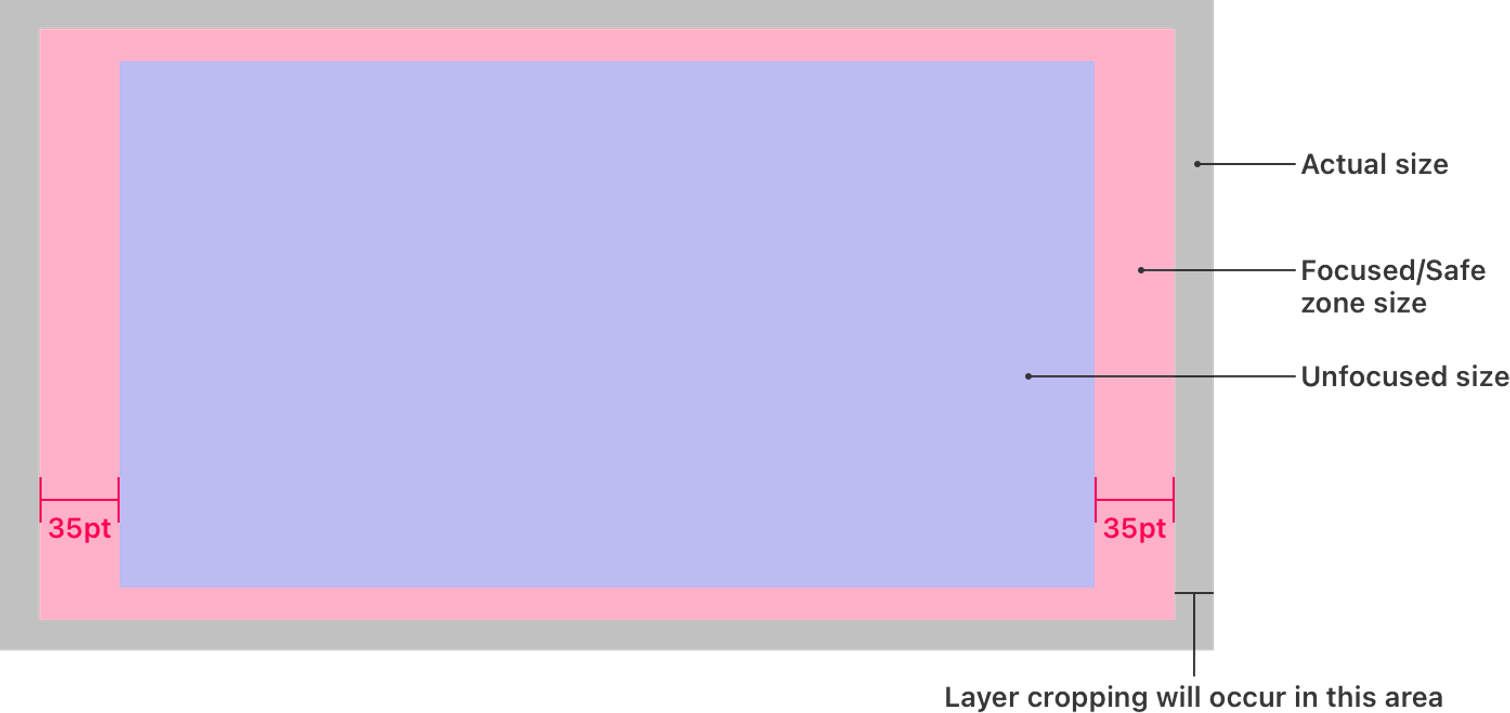
아래의 공식은 초점이 맞지 않을 때 이미지의 크기에 따라 레이어 이미지의 크기를 계산하는데 도움을 준다.
| 이미지를 고려할 때 | 집중/안전구역크기 | 실측사이즈 |
| 가장 긴 경우 | 가장 긴 변의 끝 점을 기준으로 +70 포인트 | 가장 긴 변의 끝 점을 기준으로 +106 퍼센트 |
| 가장 짧은 경우 | 가장 긴 변을 기준으로 비례하게 | 가장 긴 변을 기준으로 비례하게 |
계층화된 이미지를 앱에 포함하거나 작동중인 콘텐츠를 가져올 수 있다. 계층화된 이미지를 어플에 사용하기 위해서는 아래의 도구를 참고해서 사용하라.
- macOS 용 미리 보기 앱. 시차 미리 보기 앱은 PNG 파일을 추가하여 각각의 층과 이미지에 넣어볼 수 있다. 시차 미리 보기 플러그인을 활용하거나, 포토샵의 계층 이미지를 사용할 수 있다. 시차 미리 보기 기능은 LSR 파일로 추출하여 Xcode 프로젝트에 바로 적용할 수 있다.
- 시차 미리 보기를 지원하는 포토샵 플러그인. 해당 플러그인을 사용하여 포토샵에서 계층화된 이미지를 추출할 수 있으며, LSR 파일로 바로 추출하여 Xcode 프로젝트에 바로 적용할 수 있다.
- Xcode. PNG 파일을 드래그하여 앱의 에셋에 추가할 수 있다. 이미지는 LSR 파일로 추출되어 Xcode에서 바로 사용할 수 있다.
앱이 동작 중인 서버에서 이미지를 검색하는 경우에 해당 이미지는 계층화된 이미지로 제공해야 한다. 직접적으로 계층화된 이미지를 만들어서는 안 되며 LSR 파일 또는 포토샵 파일을 사용하여 Xcode에 적용될 수 있는 형식으로 추출해야 한다. 계층화된 이미지는 다운로드될 의도로 사용되어야 하며, 앱 자체에 내재되면 안 된다.
The following formulas can help you calculate sizing for a layered image based on the size of the image when it’s not in focus.
You can embed layered images in your app or retrieve them from a content server at runtime. To create layered images for inclusion within your app, use one of the following tools:
- Parallax Previewer app for macOS. Parallax Previewer can import PNG files to serve as individual layers, layered images (. lsr) created with the Parallax Exporter plug-in, and layered Photoshop images (. psd). Parallax Previewer can export LSR files that you can import directly into an Xcode project.
- Parallax Exporter Adobe Photoshop plug-in. Use this plug-in to test your layered images in Photoshop and export them as LSR files that you can import directly into an Xcode project.
- Xcode. Drag standard PNG files into your app’s asset catalog to serve as individual layers of an image stack in Xcode. Image stacks can be exported as LSR files. Xcode can also import LSR files.
If your app retrieves layered images from a content server at runtime, you must provide those images in runtime layered image (.lcr) format. You don’t create runtime layered images directly; you generate them from LSR files or Photoshop files using the layerutil command-line tool that Xcode provides. Runtime layered images are intended to be downloaded — don’t embed them within your app.
visionOS
visionOS에서 시스템은 사람들이 보는 각도와 거리에 따라 이미지가 차지하는 면적에 따라 달라진다. 이는 이미지가 플랫폼에서 제공하는 화면의 비율과 비교하여 1:1이 안될 수도 있음을 의미한다.
visionOS의 앱 아이콘은 다층 이미지로 만들어라.
벡터 기반으로 만들어라. 비트 단위로 만드는 것은 피라는 게 좋은데 시스템의 비율이 확대되면 정확하게 보이지 않을 수 있기 때문이다. 코어 애니메이션 계층을 사용하는 경우 visionOS의 가이드를 참고하라.
래스터화된 이미지를 사용해야 하는 경우 해상도를 선택할 때 품질과 성능의 균형을 맞춰라. 비록 2배율의 이미지는 일반적인 거리에서 잘 보이지만, 고정된 해상도는 비율이 변하는 경우 깔끔하게 보이지 않을 수 있다. 래스터화 된 이미지가 잘 보이기 위해서는 고해상도 이미지를 적용해야 한다.
하지만 고해상도 이미지를 사용하면 파일의 크기가 커짐으로 인해 런타임의 수행 능력이 떨어질 수 있다. 특히 6배율 이상의 이미지가 그러한 오류를 발생시킨다. 2 배율 이상의 해상도를 사용하는 경우 고품질 영상 필터링을 적용해서 품질과 성능의 균형을 유지해야 한다.
In visionOS, the area an image occupies typically varies when the system dynamically scales it according to the distance and angle at which people view it. This means that an image doesn’t line up 1:1 with screen pixels as it can in other platforms.
Create a multilayered image for your visionOS app icon. For guidance, see App icons.
Prefer vector-based art. Avoid bitmap content because it might not look good when the system scales it up. If you use Core Animation layers, see Drawing sharp layer-based content in visionOS for developer guidance.
If you need to use rasterized images, balance quality with performance as you choose a resolution. Although a @2x image looks fine at common viewing distances, its fixed resolution means that the system doesn’t dynamically scale it and it might not look sharp from close up. To help a rasterized image look sharp when people view it from a wide range of distances, you can use a higher resolution, but each increase in resolution results in a larger file size and may impact your app’s runtime performance, especially for resolutions over @6x. If you use images that have resolutions higher than @2x, be sure to also apply high-quality image filtering to help balance quality and performance (for developer guidance, see [filters](<https://developer.apple.com/documentation/quartzcore/calayer/1410901-filters>)).
watchOS
일반적으로 이미지 파일을 작게 유지하기 위해서는 투명성을 피하라. 항상 같은 단색의 배경에 이미지를 합성하는 경우에는 처음부터 이미지 자체에 배경을 포함하는 것이 효과적이다. 그러나 시스템이 색을 적용할 위치를 결정하기 위해 복잡한 이미지, 메뉴 아이콘 및 템플릿 이미지 역할을 하는 기타 인터페이스 아이콘에서는 투명성이 필요하다.
모든 화면에 대해 동일한 크기로 제공하기 위해서는 PDF를 활용하라. 40mm 및 42mm 화면에 들어갈 아이콘에 한해 2배율로 만들면 된다. PDF를 업로드하면 자동으로 화면의 크기에 따라 이미지의 크기를 조정한다.
| Screen size | Image scale |
| 38mm | 90% |
| 40mm | 100% |
| 41mm | 106% |
| 42mm | 100% |
| 44mm | 110% |
| 45mm | 119% |
| 49mm | 119% |
In general, avoid transparency to keep image files small. If you always composite an image on the same solid background color, it’s more efficient to include the background in the image. However, transparency is necessary in complication images, menu icons, and other interface icons that serve as template images, because the system uses it to determine where to apply color.
Use autoscaling PDFs to let you provide a single asset for all screen sizes. Design your image for the 40mm and 42mm screens at 2x. When you load the PDF, WatchKit automatically scales the image based on the device’s screen size, using the values shown below:
+) 시차효과가 뭘까?
Parallax effect? 난생처음 보는 단어에 급하게 구글링을 해보았다.
multiple layers를 사용하여 시차효과를 만든다고는 하는데,, 우선 찾아본 정보를 정리하자면
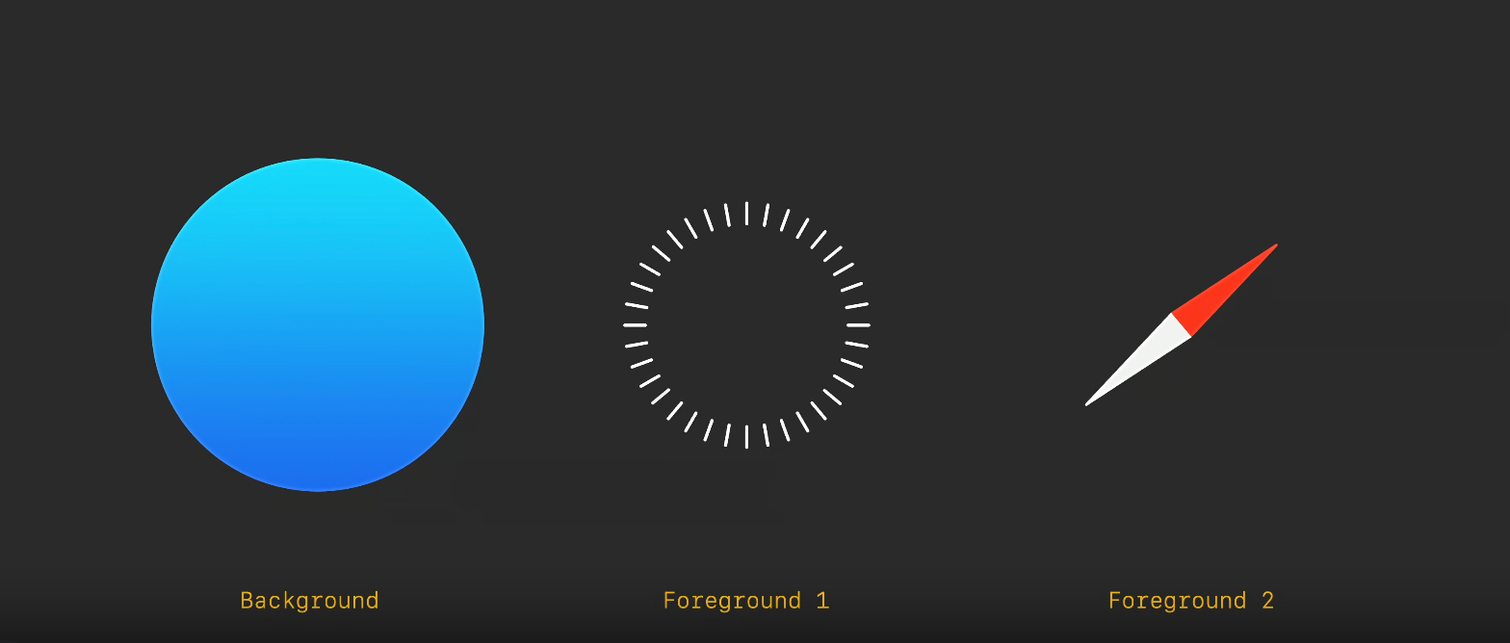
각 레이어는 사각형 이미지 형태로 1024*1024 픽셀의 크기를 갖는다.
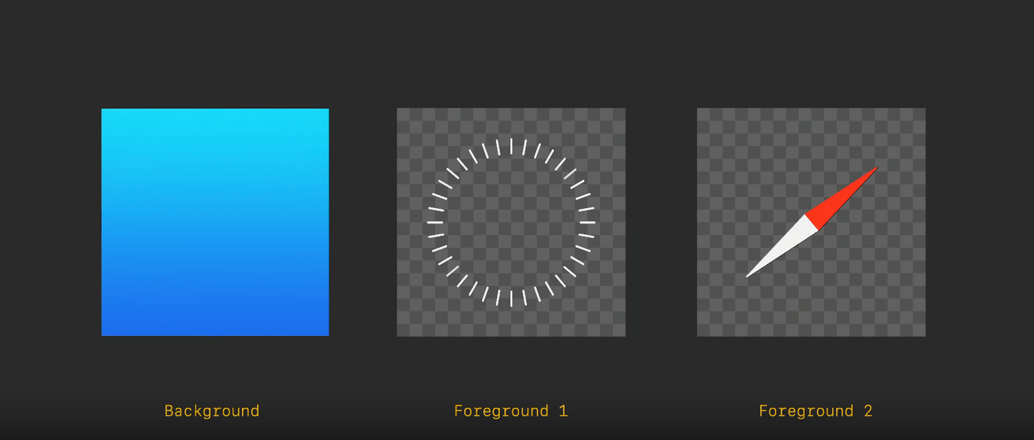
2개의 Foreground 레이어는 모두 투명한 배경이어야 하며 Background 레이어 edge to edge square로 디자인되어야 한다. 이러한 요소들이 합쳐지면 층이 자동으로 생기고, specular 하이라이트, 그림자가 적용되어 시차효과가 적용된 이미지를 얻을 수 있게 되는 것이다.
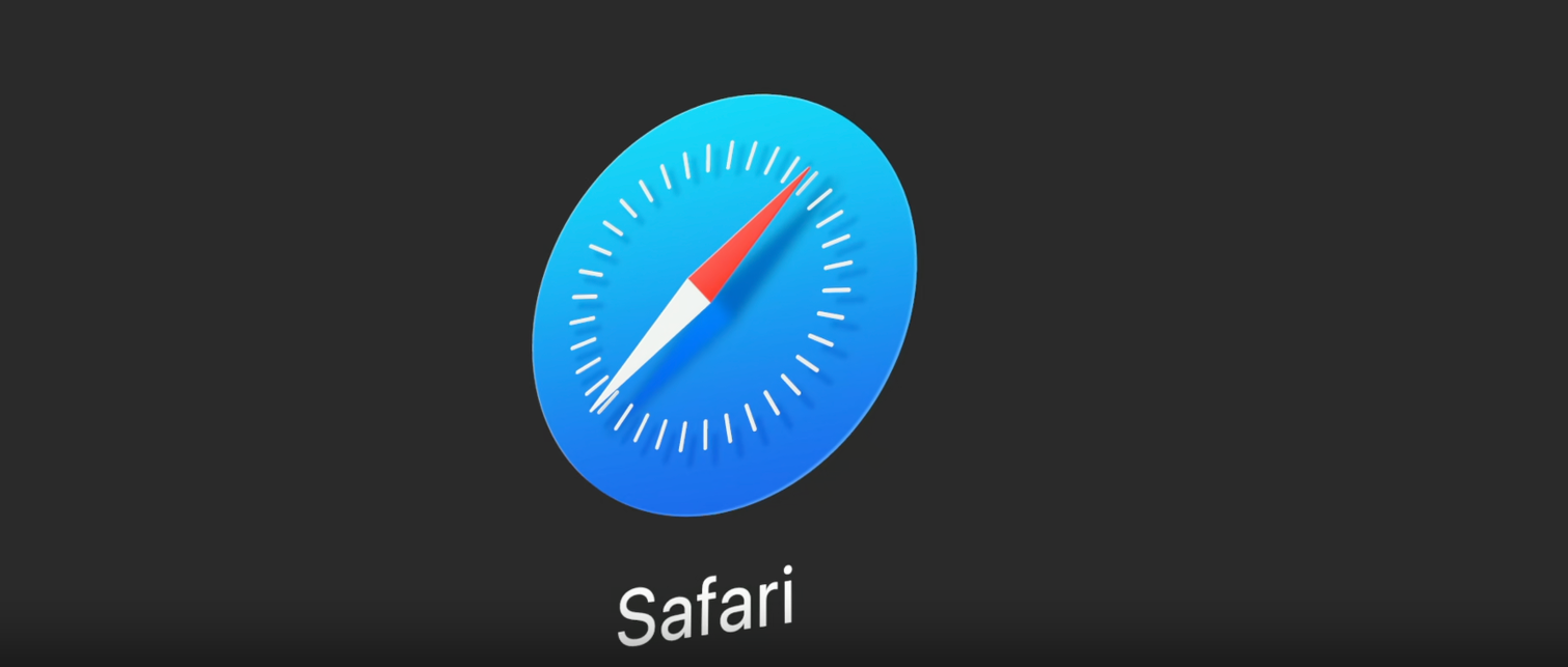
그래픽 요소들은 모두 중앙에 맞추고 edge 모소리에 너무 가깝지 않게 배치되어야 한다고 한다.
새롭게 접한 내용이라 좀 더 찾아보았다.
해당 글을 참고하여 정리했다. Parallax scrolling과 관련된 내용이다.
Parallax scrolling은 2011년 시작된 이래 역동적이고 몰입감 있는 사용자 경험을 제공하는 웹 디자인 기법이다. 이 기법은 사용자가 웹 페이지를 스크롤할 때 배경이 전경 요소보다 느리게 움직이도록 하여 깊이에 대한 환상을 만드는 기술이다. 사용자가 공유하고자 하는 방대한 정보를 스크롤할 때 Parallax scrolling을 활용하여 사용자가 더 많은 탐색을 할 수 있도록 유도한다고 한다.
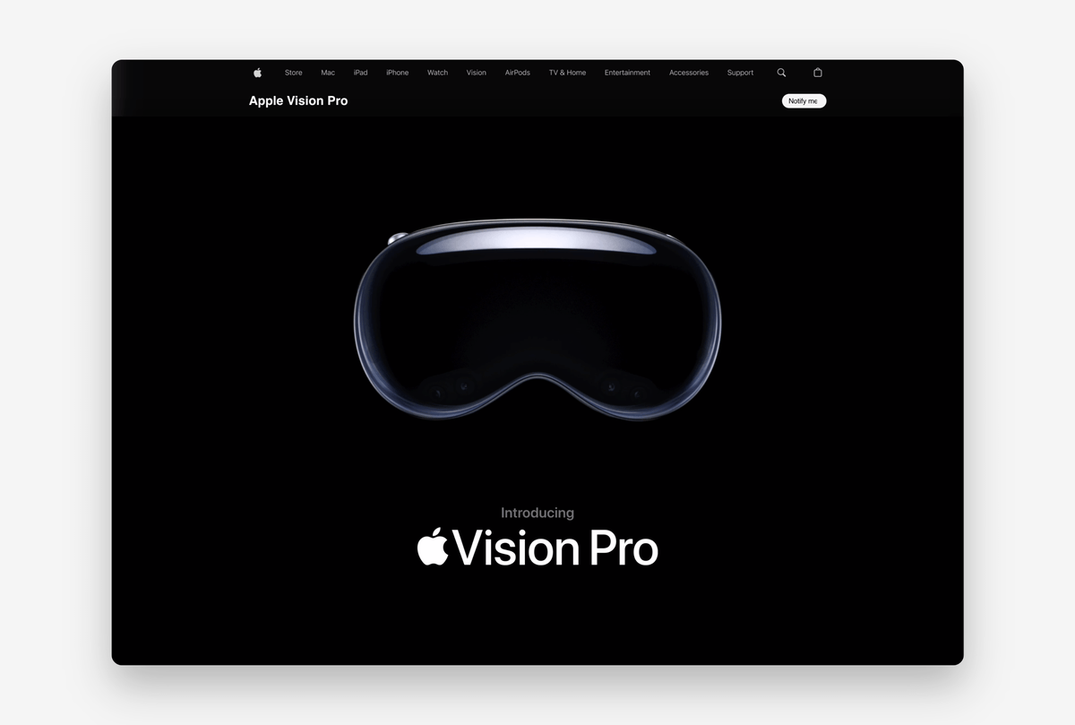
애플에서 최근 발표한 비전 프로 소개 페이지에 Parallax scrolling이 적용되었다고 한다. “와…” 라는 말밖에 안 나온다.
+) HIG를 공부하고
아이콘을 만드는 과정, 이미지를 만드는 과정에는 계층화된 이미지가 사용된다는 것을 새롭게 알 수 있었다. 자체적으로 제공하는 그림자, 명암 효과를 사용하기 위해서는 하나의 계층에 이미지를 만드는 것이 좋은 방법이 아니라는 것을 알게 되었다.
그러나 watchOS의 경우 다층의 이미지를 만드는 것보다는 단색으로 이미지 자체에 배경을 넣으라는 가이드라인을 보고, 각각의 플랫폼에 맞는 방식이 있다는 사실에 가이드라인의 세심함에 놀랐다. 지금까지 프로젝트를 하며 아이콘이나 이미지를 만드는 과정을 직접적으로 겪어보지 못했을뿐더러 크게 신경 쓰지 않았던 부분인데, 이번 기회에 새로운 내용을 배울 수 있어서 좋았다.
Parallax effect라는 기술도 처음 접해보았는데, 애플 신제품 홈페이지에서 적용된 사례를 보며 다시 한번 시차효과 기술이 뭔지 정리하고 넘어갈 수 있었다. visionOS에 얼마나 큰 힘을 들이고 있는지 다시 한번 느낄 수 있었다. 단순히 기술적인 부분을 넘어 사용자에게 보이는 경험, 사용하는 경험을 중시한다는 점에서 UX와 UI가 기술에 상당한 영향을 미친다는 것을 느낄 수 있었다.
참고한 블로그
[Design] WWDC23 Design for Spatial user interfaces 공간 사용자 인터페이스를 위한 설계
[Design] WWDC23 Design for Spatial user interfaces 공간 사용자 인터페이스를 위한 설계
WWDC23, Apple 세계 개발자 컨퍼런스가 2023년 6월 6일 새벽에 열렸다. 다양한 업데이트와 더불어 Vision Pro라는 신제품을 알리며 개발자와 디자이너들에게 큰 주목을 받고 있다. https://developer.apple.com/vi
velog.io
https://www.protopie.io/blog/parallax-effect
How to Recreate Apple’s Parallax Effect
Learn how to perfect the parallax effect to elevate web experiences with this Apple Vision Pro-inspired clone.
www.protopie.io
'iOS > HIG' 카테고리의 다른 글
| [HIG] Inclusion 포함 (1) | 2024.01.05 |
|---|---|
| [HIG] Immersive experiences 몰입 경험 (2) | 2023.12.21 |
| [HIG] Icons 아이콘 (0) | 2023.12.09 |
| [HIG] Dark Mode 다크모드 (1) | 2023.11.26 |
| [HIG] Color 색상 (0) | 2023.11.19 |


